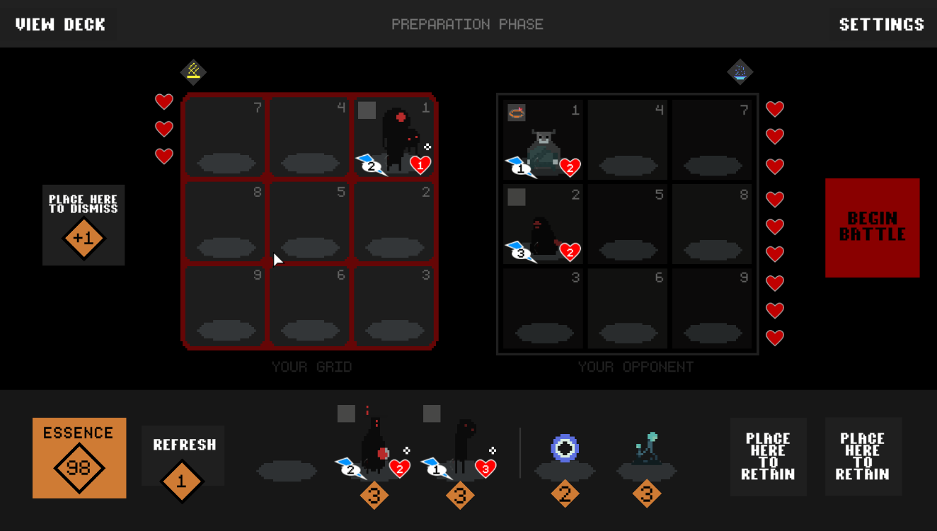
New Store/Battle Screen Preview - Oct. 29, 2022
Order Automatica » Devlog

We're still working away on making improvements to the game and I thought I'd preview the next one because it might take me a little while.
Above is a mockup of the new store/battle screen. What we're trying to do is to merge the store and battle screens into one. Why?
- The latest version added a "Preview Next Enemy Team" option, which we think is a great feature. We're inspired here by games like Into The Breach, which provide you with full knowledge of your upcoming challenge. Unlike online multiplayer auto battlers which need to remain fair, Order Automatica is more about presenting the player with asymmetrical challenges. Since battles are resolved automatically, the strategic depth of the game is all about planning your team structure. Knowing what the upcoming team looks like gives players the ability to go even more in depth with this planning. So in short, instead of making you press a button see the next enemy team, we feel like we should just always show them.
- We're also exploring giving you a preview of all the enemy team's store actions. Ideally, you'll see the enemy team move all their allies/items into place. This will give a few benefits. First, it will act as a bit of a tutorial of sorts - letting you see what kind of decisions you are able to make. Second, it will give you a moment to watch the enemy team being formed, and once you're familiar with most of the ally and item abilities that is all you will need to know what kind of strategic decisions you need to think about.
Anyway, thank for reading and I'm really excited about this change. If you have any feedback or thoughts let me know!
Order Automatica
Roguelike Auto Battler
| Status | In development |
| Author | New Beings |
| Genre | Strategy |
| Tags | Auto Battler, autochess, Deck Building, Pixel Art, Roguelike, Roguelite, Turn-based, Turn-based Strategy |
| Languages | English |
More posts
- 0.9.85 - November 13, 202538 days ago
- 0.9.7 - September 1, 2025Sep 01, 2025
- 0.9.61 - May 17, 2025May 18, 2025
- 0.9.6 - March 30, 2025Mar 30, 2025
- 0.9.5 - October 5, 2024Oct 06, 2024
- 0.9.4 - August 18, 2024Aug 18, 2024
- 0.9.3 - May 19, 2024May 20, 2024
- 0.9.2 - March 20, 2024Mar 30, 2024
- 0.9.1 - March 16, 2024Mar 16, 2024
- 0.9.0 Update - March 9, 2024Mar 09, 2024
Leave a comment
Log in with itch.io to leave a comment.